This task can be performed using Bklit UI
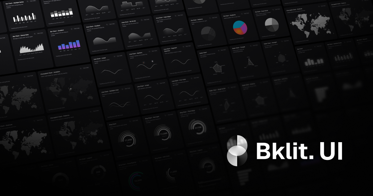
Build powerful charts faster with Bklit UI’s ready-made components
Best product for this task
Bklit UI
ui-ux
Bklit UI is a pre-release component library that adds charting and data visualization elements to React projects using shadcn/ui. It helps developers quickly assemble consistent dashboards and analytics interfaces with reusable, theme-aligned components.
What to expect from an ideal product
- Drop pre-built chart components directly into your React dashboard instead of coding visualizations from scratch
- Keep all your charts looking uniform across different pages by using the same base components and theme settings
- Speed up development time by grabbing ready-made bar charts, line graphs, and data tables without custom CSS work
- Match your existing shadcn/ui design system automatically so charts blend seamlessly with your current interface
- Build analytics dashboards faster by combining different chart types that already work well together out of the box